
Color Palettes Inspired by the Crescent City
- May 27, 2025
- 5 min read
Updated: Jul 16, 2025

Color Palettes Inspired by the Crescent City—Because New Orleans doesn’t do beige.
In New Orleans, color isn’t just aesthetic—it’s attitude. It drips from shotgun houses and dances in second lines. It’s baked into beignets, stitched into Mardi Gras throws, and splashed across festival flyers. So it’s no surprise that when we design at Midnight Boheme, we reach straight into the soul of the Crescent City for our color inspiration.
Here are some of our favorite NOLA-inspired color palettes—each one bursting with local flavor, character, and a touch of magic.
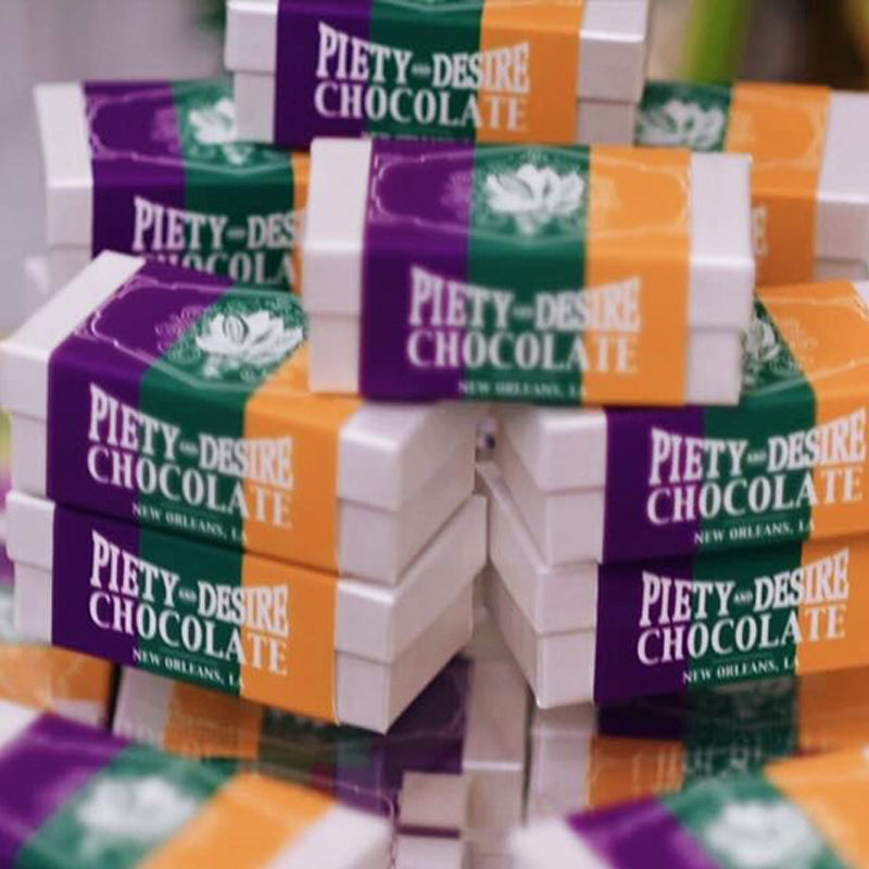
🎭 1. Mardi Gras Royalty
Colors: Rich purple, emerald green, gold foil, black velvet
Mood: Bold. Festive. A little bit decadent.
Use it when: You want to turn heads, throw confetti, or build a brand that knows how to make an entrance.
Inspiration: Beads flying from balconies, the shimmer of a sequin mask, and the rhythm of a marching band at sunset.
Sample Client Work: Piety & Desire Chocolate

🌿 2. Garden District Dreams
Colors: Sage green, soft lavender, cream, faded brick
Mood: Elegant. Quietly enchanting. Timeless.
Use it when: You want your brand to feel romantic, rooted, and oh-so-refined.
Inspiration: Magnolia blossoms, antique shutters, and lazy afternoon strolls under oak canopies.
Sample Client Work: The French Quarter Business Association

☕ 3. Café au Lait & Beignets
Colors: Warm taupe, powdered sugar white, espresso brown, blush pink
Mood: Cozy. Friendly. Deliciously sweet.
Use it when: Your vibe is approachable, welcoming, and low-key indulgent.
Inspiration: Mornings at Café du Monde, sugar-dusted lips, and the soft chatter of French Quarter courtyards.
Sample Client Work: Orleans Coffee

🎷 4. Frenchmen Funk
Colors: Electric blue, neon coral, brass gold, midnight navy
Mood: Cool. Artistic. Unpredictably fun.
Use it when: You want to stand out, break rules, and leave a lasting impression.
Inspiration: Jazz riffs through open windows, glowing marquee lights, and local art splashed across alleyway walls.
Sample Client Work: Alice & Amelia

🪞 5. Haunted Glamour
Colors: Charcoal black, ghost white, absinthe green, blood red
Mood: Moody. Mysterious. Luxe with an edge.
Use it when: Your brand has a gothic soul and a flair for the dramatic.
Inspiration: Candlelit séances, wrought iron gates, and stories whispered under Spanish moss at midnight.
Sample Client Work: Bourbon Orleans Hotel - The Ghost Sightings Log and Bourbon Orleans Hotel Hauntings History & Brochure

🍸 6. Cocktail Hour on Bourbon
Colors: Sunset orange, cherry red, mint green, vintage teal
Mood: Playful. Flirty. A little retro.
Use it when: You want your brand to feel vibrant, fun, and ready for a good time.
Inspiration: Hurricane glasses, neon signs, clinking ice cubes, and glittering laughter spilling into the street.
Sample Client Work: Have Fun Dammit - Playing Cards

🛶 7. Bayou Reverie
Colors: Cypress green, muddy brown, misty gray, sunset peach
Mood: Earthy. Dreamlike. Quietly wild.
Use it when: You want your brand to feel grounded, soulful, and a little mysterious.
Inspiration: Fog rolling over still waters, Spanish moss swaying in the breeze, and the soft croak of frogs echoing through the swamp at dusk.
Sample Client Work: SwampTours.com

🚪 8. Brick & Stucco Charm
Colors: Weathered terracotta, cream stucco, wrought iron black, olive green
Mood: Historic. Textured. Authentic.
Use it when: You want your visuals to feel timeworn, grounded, and full of character.
Inspiration: Cracked facades of Creole cottages, peeling paint on pastel shutters, and the sun setting over courtyard vines.
Sample Client Work: Hermann-Grima + Gallier Historic Homes Wine Fête

🎺 9. Jazz Club After Dark
Colors: Indigo blue, smoky gray, brass gold, plum
Mood: Smooth. Sultry. Late-night cool.
Use it when: Your brand vibes with rhythm, mood lighting, and a little improvisation.
Inspiration: Saxophone solos spilling out of Frenchmen Street bars, candlelit lounges, and the velvet hush between musical notes.
Sample Client Work: Saddle Bar

🐊 10. Cajun Heat
Colors: Cayenne red, mustard yellow, spicy orange, cast iron black
Mood: Fiery. Rustic. Flavor-packed.
Use it when: Your project calls for bold choices, vibrant culture, and a little backroad grit.
Inspiration: Crawfish boils, accordions at the fais do-do, and gumbo bubbling on a wood stove.
Sample Client Work: Lancaster House

🌞 11. Southern Summertime
Colors: Lemonade yellow, watermelon pink, pool blue, iced mint
Mood: Bright. Breezy. Easygoing.
Use it when: You want your design to feel refreshing, fun, and full of sunshine.
Inspiration: Porch fans spinning lazily, sno-balls dripping down your hand, and long golden hours before a summer storm rolls in.
Sample Client Work: La Rive Kombucha
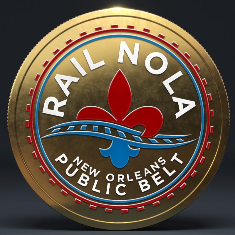
⚓ 12. Steamboat Elegance
Colors: Pearl white, deep navy, gilded gold, smoke gray
Mood: Refined. Nostalgic. Graceful.
Use it when: You want timeless charm with a touch of Southern sophistication.
Inspiration: Paddlewheels slicing through the Mississippi, polished brass railings, and calliope music in the distance.
Sample Client Work: Rail NOLA / NOPB (New Orleans Public Belt Railroad)

🦐 13. Culinary Carnival
Colors: Buttercream, crawfish red, cornbread yellow, parsley green
Mood: Lively. Savory. Celebratory.
Use it when: You want your brand to feel rich in flavor, texture, and tradition.
Inspiration: Piles of seafood, po'boys on parchment, and the vibrant chaos of a well-loved kitchen.
Sample Client Work: Laura's Candies & The Great Southern Praline Company

🕊️ 14. Plantation Decadence
Colors: Soft ivory, sky blue, magnolia green, tarnished bronze
Mood: Graceful. Quietly powerful. Lush.
Use it when: You want to evoke Southern elegance, romanticism, and a sense of place.
Inspiration: Wide porches, slow fans, lace curtains, and the scent of jasmine carried on a breeze.
Sample Client Work: Ormond Manor

🪦 15. Cemetery Strolls
Colors: Marble white, aged stone gray, moss green, candlelight gold
Mood: Poetic. Sacred. Timelessly beautiful.
Use it when: Your aesthetic leans toward the mystical or reverent with a nod to the past.
Inspiration: Crumbling tombs, shadowed walkways, and whispered legacies in the Cities of the Dead.
Sample Client Work: Ghost Adventures

🛻 16. Carriage Ride Romance
Colors: Dusty rose, leather brown, slate blue, gaslight amber
Mood: Classic. Slow-paced. Charming.
Use it when: Your brand needs a soft touch of nostalgia and a leisurely rhythm.
Inspiration: Hooves on cobblestone, carriage lanterns glowing at dusk, and lovers winding through historic streets.
Sample Client Work: Royal Carriages

🌶️ 17. Creole Soul
Colors: Eggplant, saffron, copper, bay leaf green
Mood: Vibrant. Rich. Cultural fusion.
Use it when: You want your visuals to celebrate heritage, spice, and layered stories.
Inspiration: Tiled kitchens, music in every language, and bold choices passed down through generations.
Sample Client Work: Southern Made
Why It Works
Color is emotional. It speaks in feelings, not words. And New Orleans? She’s fluent in them all. At Midnight Boheme, we use Crescent City-inspired palettes to inject every project with authenticity, depth, and a little local flair. Because a strong brand shouldn’t just be seen—it should be felt.
Color isn’t just what we see—it’s what we feel. And when you build your brand with palettes drawn from Louisiana’s deepest roots and brightest blooms, you invite your audience into something personal, flavorful, and unforgettable.
📍Want to design with a Southern soul? Midnight Boheme speaks fluent Louisiana. Let’s craft a brand identity that tastes, feels, and sings like home.