
Flavors on the Page: How to Match Menu Design to Your Culinary Brand
- Jul 18, 2025
- 3 min read

You can taste a brand before you ever take a bite.
That first impression—whether it’s a drink list, dinner menu, or dessert insert—sets the tone for everything to come. Is your restaurant rustic and romantic? Bold and buzzy? Sleek and chef-driven? Whatever your flavor, your menu design should reflect it perfectly.
At Midnight Boheme, we design menus that do more than list dishes—they translate your culinary identity into visual form. Here's how to design menus that match your flavor, feed your brand, and make mouths water.

🍝 1. Start with Your Story
Every great restaurant has a story. Your menu should help tell it.
Ask yourself:
What’s your culinary point of view? (Southern comfort, French finesse, funky fusion?)
Who are you speaking to? (Locals, tourists, foodies, cocktail connoisseurs?)
What emotions should your space evoke? (Romance? Celebration? Comfort?)
From there, we select fonts, colors, and layouts that mirror that mood—from elegant and understated to bold and playful.
🖋 Your menu is your mission statement in disguise.


🎨 2. Typography That Tastes Right
Fonts are flavor too.
Just like a dish needs the right seasoning, your menu needs the right type.
Some examples we love:
Serif fonts for upscale bistros and vintage-inspired cafés
Handwritten typefaces for cozy bakeries or neighborhood brunch spots
Clean sans-serifs for modern kitchens, juice bars, or sushi lounges
Deco or gothic styles for speakeasies and cocktail dens
✨ Typography sets the tone before the first course hits the table.
🌈 3. Use Color to Flavor the Experience
Color isn’t just pretty—it’s psychological.
Warm hues (reds, oranges, golds) = appetite stimulators
Earth tones = organic, comforting, rustic
Deep navy and black = luxury, bold flavor, mystery
Pastels and bright colors = freshness, vibrancy, casual energy
We use color to season the page the same way you season a dish—strategically and intentionally.
🎨 Your palette should match your plate.

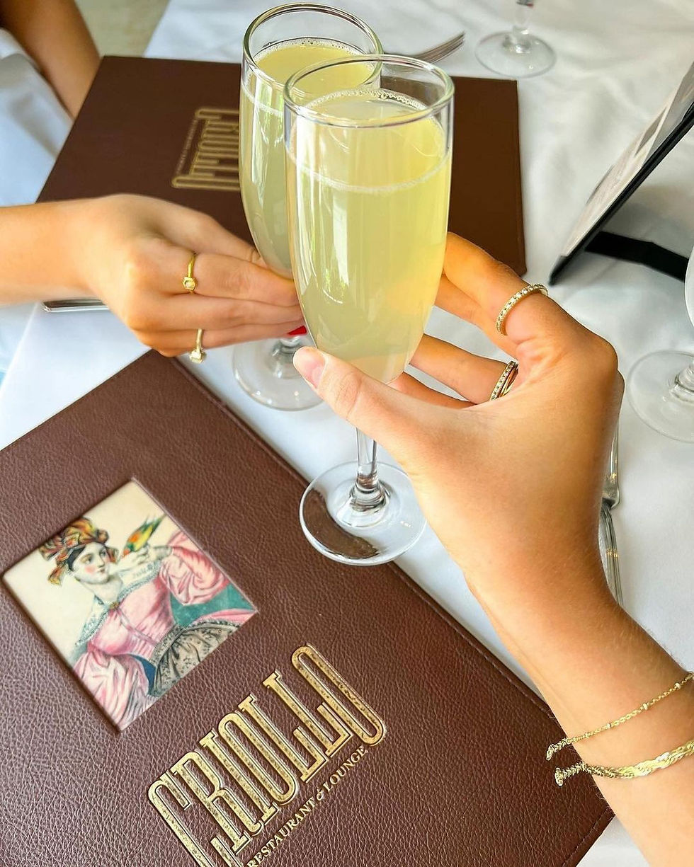
📐 4. Format Follows Function
What type of restaurant you are affects how your menu should be designed.
Fine dining? Sleek booklets with textured covers, elegant spacing, and minimal ornamentation.
Casual diner? Laminated one-sheets with friendly fonts and energetic groupings.
Bar or speakeasy? Tall, narrow cocktail menus or wrap-around paper scrolls for intrigue.
Pop-up or food truck? Bold posters or chalkboard menus that scream flavor fast.
📄 A well-chosen format makes your food easier to understand—and more tempting to try.

✍️ 5. Don’t Forget the Voice
Design is visual, but voice adds flavor.
We help you pair your look with language that matches your brand:
Descriptive dish names vs. minimalist listings
Clever cocktail puns vs. refined tasting notes
Chef’s notes, origin stories, or wine pairing tips
Local references or inside jokes for neighborhood fans
🗣 Great menus speak. The best ones flirt.
🌙 Midnight Boheme: Menus That Match Your Mood
We’ve designed menus for:
Rib Room – Old-world French Quarter elegance with a modern twist
Backspace Bar & Kitchen – Vintage sophistication and dreamy cocktails
Woody's Roadside – Menu posters with punch and personality
Ormond Manor – Wedding catering menus as beautiful as the plantation
Barrow's Catfish – Custom restaurant menus tailored to brand tone
Each one is a reflection of the food, the vibe, and the soul of the brand.
Midnight Boheme🎨 Menu Design & Culinary Branding | New Orleans, LA
We bring flavor to the page—beautifully, boldly, and always on brand.